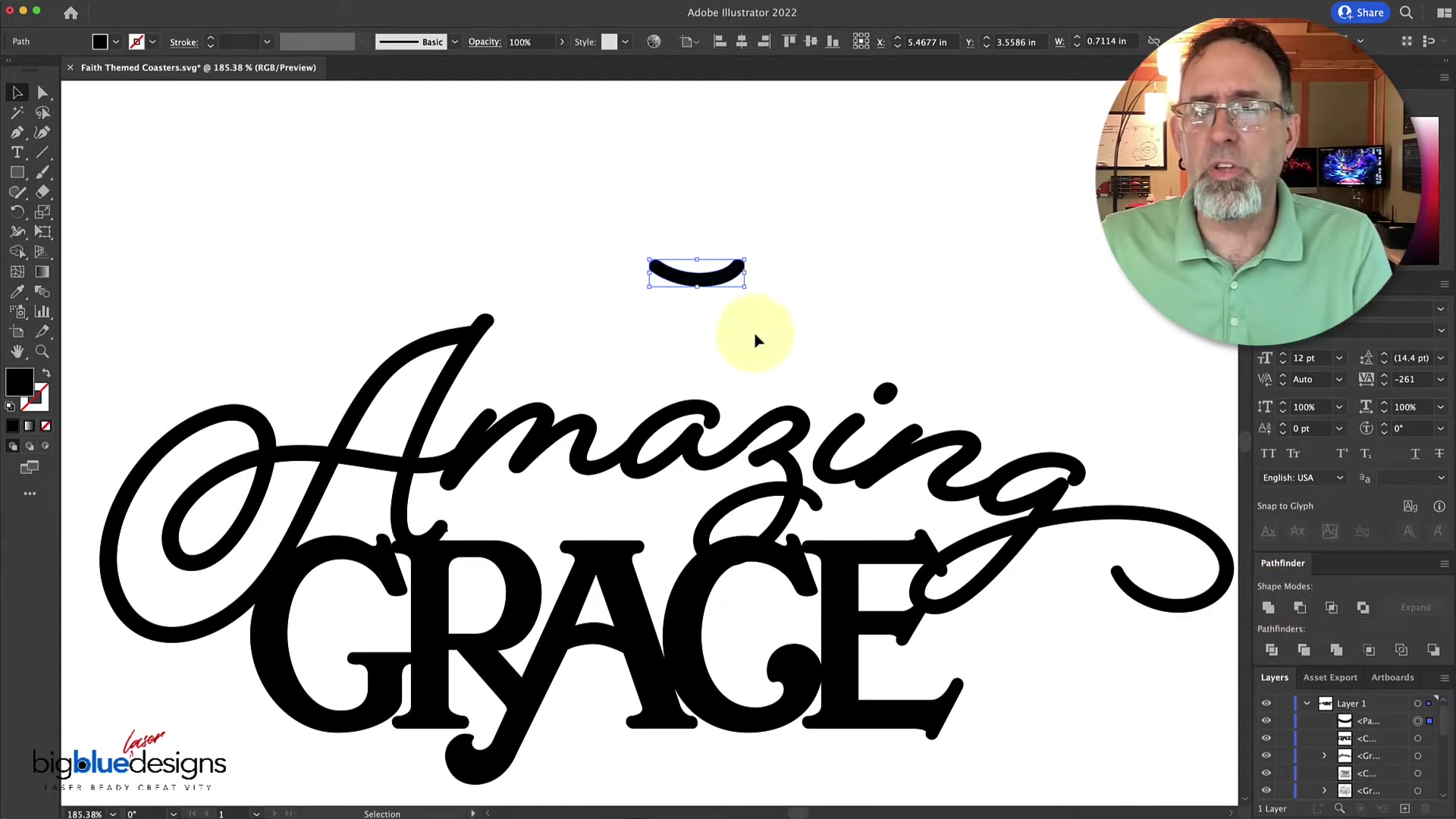






Connect Script Font Letters in Illustrator: A Tutorial

Updated on Apr 26,2025

Working with script fonts in Adobe Illustrator can be tricky, especially when you need to create a solid, connected design for laser cutting or other projects. This tutorial provides a simple yet effective method to connect letters in a script font, ensuring a clean and robust final product. Whether you’re designing coasters, signs, or any other creative project, mastering this technique will significantly improve your workflow and the quality of your designs. Let's dive in and learn how to bridge those gaps and create a cohesive design using Adobe Illustrator.

Key Points

Learn to connect letters in script fonts for laser cutting.

Utilize existing font symbols to create seamless connections.

Enhance design workflow in Adobe Illustrator.

Create robust and solid designs for various creative projects.

Use Pathfinder tools to unite shapes and create cohesive designs.

Understanding the Challenge of Script Fonts

Why Connecting Letters Matters

When working with script fonts, it's common to encounter letters that don't naturally connect. This can be problematic if you're planning to laser cut the design or create a solid Shape for any other purpose. Without connecting the letters, your design will fall apart, lacking the necessary structural integrity. Connecting letters ensures that your design is a single, Cohesive piece, resulting in a stronger and more visually appealing outcome. Mastering this technique allows for the creation of complex designs that maintain their integrity. The ability to manipulate script fonts extends the creative possibilities, providing a level of control that's crucial for professional design work. This is particularly useful in logo design, sign making, and other areas where visual consistency and structural reliability are paramount.

Common Approaches and Their Limitations

There are several ways to approach the task of connecting letters in script fonts. Some designers opt for the pen tool to manually draw connecting lines or arcs. While this offers maximum control, it can be time-consuming and requires a steady HAND to match the font's natural curves. Another option is using simple lines and bending them to fit. However, this often results in connections that look unnatural and out of sync with the Font's aesthetic. These traditional methods, while functional, often lack the finesse needed for professional-looking designs. They can also be difficult for beginners to master, leading to inconsistent results. Understanding these limitations is key to appreciating the value of the technique presented in this Tutorial, which aims to simplify the process and achieve more seamless connections.

A Smart Trick: Leveraging Font Symbols for Seamless Connections

Exploring Font Symbols: An Often-Overlooked Resource

Many script fonts include a variety of symbols, swashes, and alternative characters that can be used to enhance your designs. These symbols are designed to complement the font's aesthetic, making them perfect for creating seamless connections between letters. By exploring the character map or glyph panel in Adobe Illustrator, you can discover a wealth of options for bridging gaps and adding Flair to your typography.
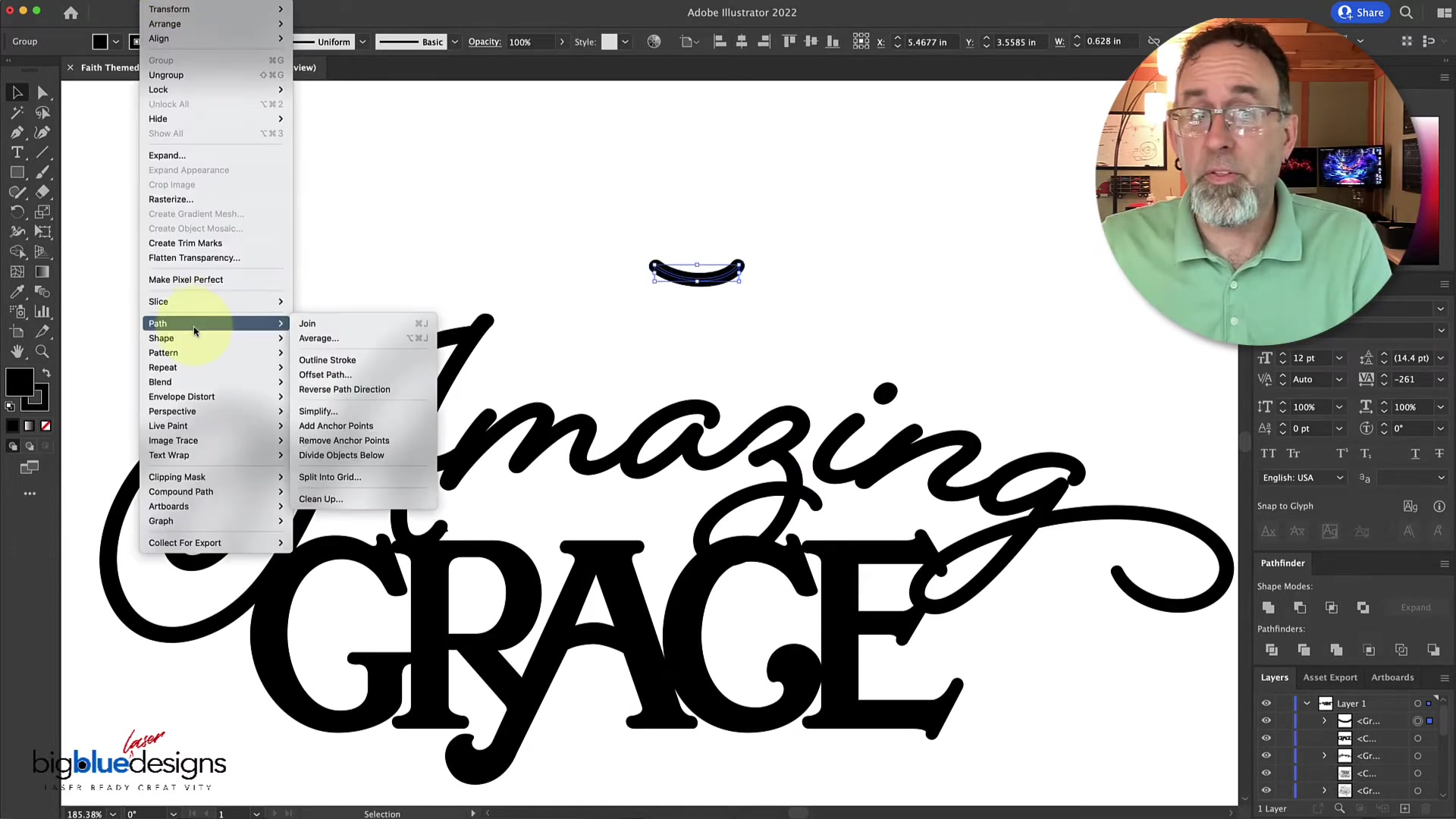
This approach leverages the font designer's original intent, ensuring that any added connections Blend harmoniously with the existing letters. Font symbols offer a quick and easy way to achieve professional-looking results without the need for extensive manual adjustments. The key is to find a symbol that matches the curve and thickness of the font, creating a visual continuity that's both elegant and structurally sound. Often, the parenthesis or bracket can be a perfect curve to use. Take the time to explore the full range of characters available in your chosen font; you might be surprised by what you find.

Step-by-Step Guide: Connecting 'Amazing' in Our Example

Let's walk through a practical example of connecting the letters in the WORD 'Amazing' using font symbols. In the Beloved Script font, the letters 'Z' and 'I' do not naturally connect, which can be a problem for laser cutting. Here’s how to use a font symbol to fix this:

  1. Select the Text Tool: In Adobe Illustrator, select the Text Tool and type the word 'Amazing'. Make sure the Beloved Script font is selected.
  2. Explore Font Symbols: With the Text Tool still active, look for the glyphs panel (Type > Glyphs). Search for a symbol that has a suitable curve for connecting the 'Z' and 'I'. In this case, a parenthesis works perfectly.
  3. Insert the Symbol: Type the parenthesis symbol. This will act as the bridge between the two letters.
  4. Create Outlines: Select the text, right-click, and choose 'Create Outlines'. This converts the text and symbol into vector shapes.
  5. Adjust the Symbol:

    Use the Selection Tool to position the parenthesis symbol between the 'Z' and 'I'. Adjust the size and rotation as needed to ensure a seamless fit. It's important to zoom in and make precise adjustments so that the symbol looks like a natural extension of the letters.

  6. Outline Stroke: Change the parenthesis into an outline. Object > Path > Outline stroke.
  7. Unite Shapes: Select the text and the parenthesis symbol. Open the Pathfinder panel (Window > Pathfinder) and click 'Unite'. This merges the shapes into a single, connected object.
  8. Clean Up: Use the Direct Selection Tool to refine the connection. Remove any overlapping nodes or adjust the curves to create a smooth transition between the letters and the symbol. This step ensures that the connection looks intentional and not like a patched-together afterthought.

By following these steps, you can create a solid, connected version of 'Amazing' that is perfect for laser cutting or any other project where a continuous design is required. This technique not only solves the immediate problem of unconnected letters but also enhances the overall aesthetic appeal of your typography.

Adding weight with strokes

After finding the parenthesis it may be to thin to match the weight of the font style you are using. An easy way to fix this is by adding a stroke to the parenthesis.
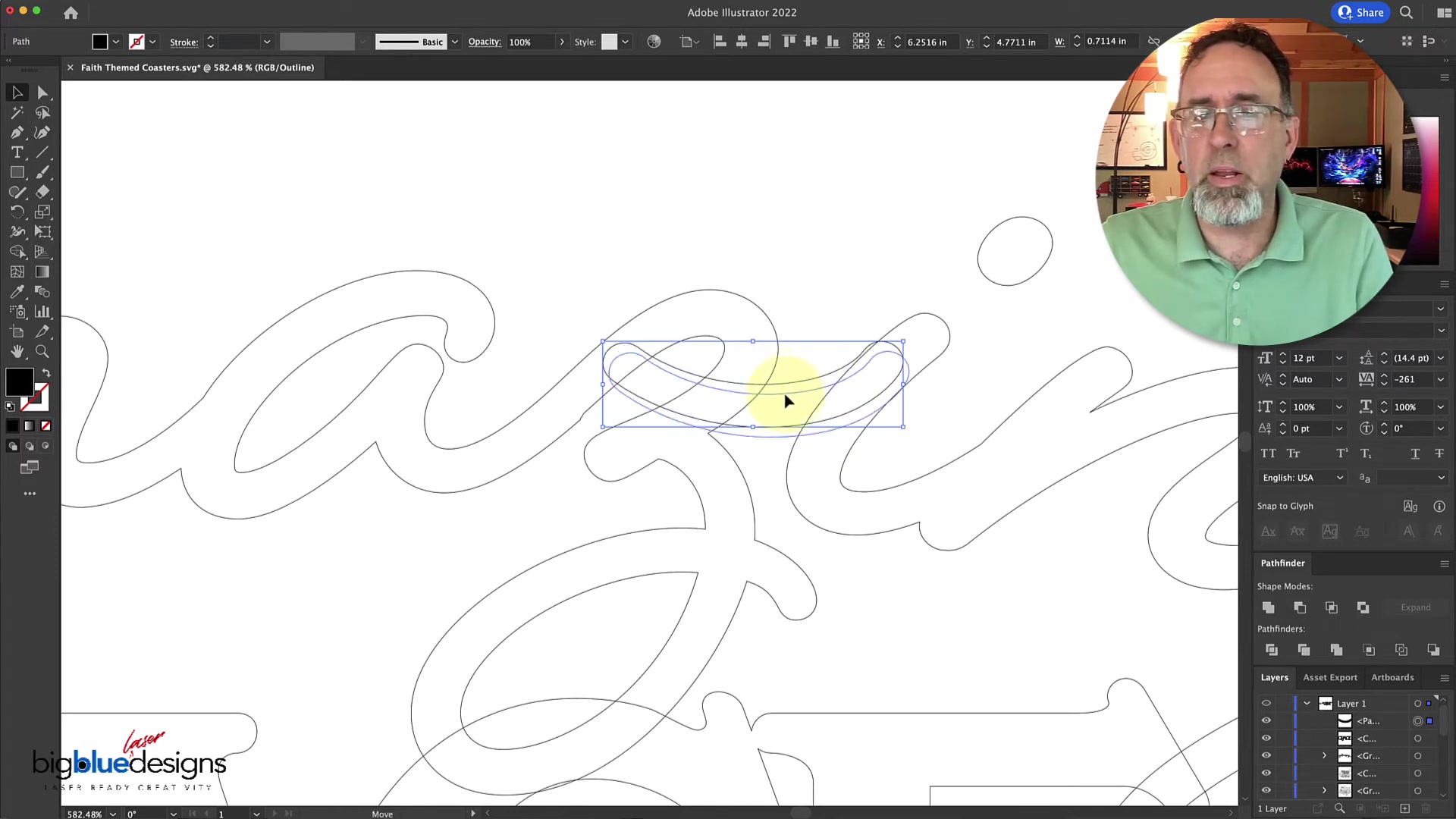
After which, outline the strokes so they are permanently part of the shape. Also, this method helps ensure that the connection aligns with the font’s overall style and thickness. This attention to detail is what separates amateur designs from professional ones, making your work stand out and appear more polished.

Zooming to Outline Mode

After uniting you may need to tweak what you have done. Zooming in to outline mode helps a lot. Command + Y (for Mac users) allows you to view only outlines. This allows you to line things up perfectly. Additionally, you may want to delete an overlapping area that may happen after you use unite. The eraser tool will be your friend for this.

Step-by-Step Guide: Using Font Symbols to Connect Letters

Step 1: Selecting Your Script Font and Text

Begin by choosing the script font you want to work with in Adobe Illustrator. Type out the word or phrase you intend to connect. Ensure that the font size and style are appropriate for your project. Selecting the right font is crucial because not all script fonts have suitable symbols for connecting letters. It's best to start with a font that has a variety of swashes, flourishes, and alternative characters. This initial step sets the foundation for the entire design process, influencing the final look and feel of your project. Consider the overall aesthetic you want to achieve and choose a font that aligns with your vision. This will make the subsequent steps much easier and more effective.

Step 2: Exploring the Glyphs Panel

Access the Glyphs panel in Adobe Illustrator by going to Type > Glyphs. This panel displays all the characters available in your selected font, including symbols, swashes, and alternative letterforms. Scroll through the panel to find a symbol that is suitable for connecting the letters in your text. Look for symbols that have a curve, thickness, and style that matches the font's aesthetic. The Glyphs panel is a powerful tool for exploring the Hidden potential of your chosen font. It allows you to discover characters that you might not otherwise know existed, opening up new possibilities for creative expression. Take your time to examine all the options and experiment with different symbols to see which ones work best for your design. Remember, the goal is to find a symbol that looks like a natural extension of the letters, creating a seamless and visually appealing connection.

Step 3: Inserting and Positioning the Symbol

Once you've found a suitable symbol, insert it into your text where you want to connect the letters. Use the Selection Tool to position the symbol precisely between the letters. Adjust the size, rotation, and spacing as needed to achieve a seamless fit. This step requires a keen eye for detail, as even small adjustments can make a big difference in the final appearance of the connection. Zoom in to get a closer look and make precise adjustments. Pay attention to the alignment of the curves and the spacing between the letters and the symbol. The goal is to create a connection that looks intentional and not like an afterthought. This meticulous approach will result in a more polished and professional-looking design. Using the direct selection tool will allow you to change and adjust the points even more.

Step 4: Creating Outlines and Uniting Shapes

Select the text and the inserted symbol, then right-click and choose 'Create Outlines'. This converts the text and symbol into vector shapes, allowing you to manipulate them as individual objects. Next, open the Pathfinder panel (Window > Pathfinder) and click 'Unite'. This merges the shapes into a single, connected object. Creating outlines is a crucial step because it allows you to treat the text and symbol as editable shapes. This gives you the flexibility to fine-tune the connections and create a seamless transition between the letters and the symbol. The 'Unite' function in the Pathfinder panel is a powerful tool for merging these shapes into a single, cohesive design. By combining these steps, you can create a solid, connected version of your text that is perfect for laser cutting or any other project where a continuous design is required. You will be able to outline the strokes here, too.

Step 5: Refining and Cleaning Up

After uniting the shapes, use the Direct Selection Tool to refine the connection. Remove any overlapping nodes, adjust the curves, and smooth out any rough edges. This step ensures that the connection looks seamless and intentional. Pay close attention to the overall flow of the design and make any necessary adjustments to enhance its visual appeal. Cleaning up the design is an essential step in creating a professional-looking result. By removing unnecessary nodes and smoothing out the curves, you can create a design that is both visually appealing and structurally sound. This meticulous approach will elevate your work and make it stand out from the crowd. In particular areas, the eraser tool can help delete any unwanted parts. Always remember to zoom in to make more precise edits.

Adobe Illustrator Pricing

Understanding Adobe Illustrator's Subscription Plans

Adobe Illustrator is available through a subscription-based model, offering various plans to suit different user needs. Understanding these pricing options is essential for choosing the plan that best fits your budget and usage requirements. The single-app plan, which includes only Illustrator, is ideal for users who primarily focus on vector graphics. The Creative Cloud All Apps plan provides access to the entire suite of Adobe applications, including Photoshop, InDesign, and more, making it a comprehensive option for designers who work across multiple disciplines. Adobe also offers discounted plans for students and educators, making its software more accessible to the academic community. Each plan comes with its own set of features and benefits, so it's important to carefully evaluate your needs before making a decision. Whether you're a professional designer or a hobbyist, there's an Adobe Illustrator plan that's right for you. Taking the time to explore these options will ensure that you get the most value from your investment. Also, keep an eye on the company website for deals and promotions!

Illustrator Single App Plan

The Adobe Illustrator Single App plan is a cost-effective option for designers who primarily use Illustrator for their vector graphics work. This plan includes access to the latest version of Illustrator, as well as 100GB of cloud storage, Adobe Portfolio, Adobe Fonts, and Behance integration. While the price can vary, it generally hovers around $20.99 per month with an annual commitment or $31.49 month-to-month. While the plan is very popular, consider if the value is worth it. It could make more sense to upgrade to Adobe Creative Cloud.

Illustrator Creative Cloud All Apps Plan

The Adobe Creative Cloud All Apps plan is perfect for designers who require multiple tools. The most popular option gives access to the full suite of Adobe applications for around $59.99 per month. While slightly more expensive, the increase value is well worth it. Additional apps include Photoshop, InDesign, Premiere Pro, and more.

Pros and Cons of Using Font Symbols for Connecting Letters

👍 Pros

Ensures connections match the font's style.

Faster and easier than manual methods.

Creates seamless and visually appealing designs.

Enhances the structural integrity of laser cutting projects.

👎 Cons

Limited by the available symbols in the font.

May require some adjustments to achieve a perfect fit.

Not suitable for all script fonts.

May lead to repetitive connection styles if overused.

Key Features of Adobe Illustrator

Vector Graphics Editing

Adobe Illustrator is renowned for its powerful vector graphics editing capabilities. Vector graphics are based on mathematical equations, which means they can be scaled infinitely without losing quality. This makes Illustrator ideal for creating logos, illustrations, and designs that need to be used in various sizes and formats. With Illustrator, you can create and manipulate complex shapes, lines, and curves with precision and ease. The software offers a wide range of tools for drawing, shaping, and transforming objects, allowing you to bring your creative visions to life. Whether you're creating simple icons or intricate illustrations, Illustrator provides the tools you need to achieve professional-looking results. Furthermore, the ability to export your designs in various vector formats, such as SVG and EPS, ensures that they can be used across different platforms and applications without any loss of quality. This is essential for maintaining visual consistency and professionalism in your design work.

Typography and Text Manipulation

Illustrator offers extensive typography tools that allow you to create stunning text-based designs. You can easily manipulate text, change fonts, adjust spacing, and apply various effects to create unique and eye-catching typography. With Illustrator, you can also convert text to outlines, giving you even more control over the shape and form of your letters. This is particularly useful for creating custom logos and branding elements. The software supports a wide range of fonts and character sets, allowing you to experiment with different styles and find the perfect typography for your project. Whether you're creating headlines, body text, or decorative typography, Illustrator provides the tools you need to achieve professional-looking results. Also, this feature can be combined with the one discussed in this article to connect script fonts!

Pathfinder Tools

The Pathfinder panel in Adobe Illustrator provides a set of powerful tools for combining and manipulating shapes. With Pathfinder, you can easily unite, subtract, intersect, and exclude shapes to create complex designs. These tools are essential for creating logos, icons, and other graphics that require precise shape manipulation. The Pathfinder panel offers a variety of options for achieving different effects, allowing you to experiment and find the perfect combination of shapes for your design. Whether you're creating simple silhouettes or intricate Patterns, Pathfinder provides the tools you need to achieve professional-looking results. As Mentioned in the article, this is great for uniting and creating a solid object.

Common Use Cases for Seamlessly Connecting Letters

Laser Cutting Projects

Laser cutting projects often require designs to be continuous and connected. Using font symbols to connect letters in script fonts ensures that the laser cutter creates a single, cohesive piece rather than individual, disconnected letters. This technique is essential for creating intricate designs that maintain their structural integrity. By creating solid, connected shapes, you can avoid the risk of small pieces breaking off or becoming detached during the cutting process. This is particularly important for projects that involve delicate or intricate designs. Using this method creates professional laser-cut results.

Logo Design

Logos that incorporate script fonts often benefit from connected letters. Connecting the letters creates a sense of flow and unity, making the logo more visually appealing and Memorable. Using font symbols to achieve this connection ensures that the logo maintains a consistent style and thickness. This is particularly important for creating logos that are scalable and can be used in various sizes without losing their visual impact. By creating a seamless and connected logo, you can enhance brand recognition and create a lasting impression on your audience. The results can be elegant and captivating, leaving clients very happy.

Sign Making

Creating signs with script fonts requires letters to be connected for both aesthetic and structural reasons. Connected letters create a more fluid and visually appealing design, while also ensuring that the sign is Durable and long-lasting. Using font symbols to achieve this connection provides a quick and easy way to create professional-looking signs that are both beautiful and functional. This is particularly important for creating signs that will be displayed outdoors, where they will be exposed to the elements. By creating a solid and connected sign, you can ensure that it will withstand the test of time and continue to look great for years to come. No matter what the environment or weather is, the sign will last!

Frequently Asked Questions

What if I can't find a suitable symbol in my font?
If you can't find a suitable symbol in your font, you can try using a different font that has more options. Alternatively, you can use the Pen Tool to manually draw a connecting line or arc. However, this requires a steady hand and a keen eye for detail to match the font's style. Always try to use symbols first to see if it is the most suitable option. This will be a sure way to maintain the aesthetic value of the font.
Can I use this technique with any script font?
Yes, you can use this technique with most script fonts. However, some fonts may have limited symbol options, making it more challenging to find a suitable connection. Experiment with different fonts to find one that works best for your project. Also, if you find it incredibly difficult, you can use the Pen Tool, as mentioned in the prior FAQ. If you think the final result is visually appealing, then you can keep it.
Is it better to use the Pen Tool or font symbols to connect letters?
Using font symbols is generally faster and easier, as it ensures that the connection matches the font's style. However, the Pen Tool offers more control and flexibility, allowing you to create custom connections that perfectly fit your design. Choose the method that best suits your needs and skill level. No matter what, practice makes perfect! This will eventually make all your designs and connections come out more perfect.

Related Questions

How can I improve my typography skills in Adobe Illustrator?
Improving your typography skills in Adobe Illustrator involves a combination of learning the software's features and developing an eye for good design. Start by exploring the various typography tools in Illustrator, such as the Character panel, Paragraph panel, and OpenType features. Experiment with different fonts, sizes, spacing, and effects to see what works best for your project. In addition, study the work of experienced typographers and designers to learn from their techniques and styles. Pay attention to the principles of typography, such as readability, hierarchy, and visual balance. Also, take online courses or workshops to deepen your knowledge and skills. By combining technical proficiency with a strong understanding of design principles, you can significantly improve your typography skills and create stunning text-based designs in Adobe Illustrator. The best part is, you can use these skills in many different ways!
What are some other useful Pathfinder techniques in Adobe Illustrator?
The Pathfinder panel in Adobe Illustrator offers a variety of powerful techniques for manipulating shapes and creating complex designs. In addition to uniting shapes, you can also use the Subtract, Intersect, and Exclude functions to create different effects. The Subtract function removes the overlapping areas of two shapes, while the Intersect function keeps only the overlapping areas. The Exclude function removes the overlapping areas and keeps the non-overlapping areas. Experiment with these techniques to create unique and interesting designs. Furthermore, you can use the Divide function to split shapes into multiple pieces, allowing you to create intricate patterns and designs. By mastering these Pathfinder techniques, you can significantly enhance your design workflow and create professional-looking graphics in Adobe Illustrator. With these skills, you can design an unlimited amount of options!

Most people like