

















Table of Contents
- Key Points
- Designing a Creative Infographic in Adobe Illustrator
- Advanced Techniques for Enhancing Your Infographic
- Step-by-Step Guide to Creating Your Own Infographic
- Adobe Illustrator for Infographics: Advantages and Disadvantages
- Frequently Asked Questions
- Related Questions


Designing a Creative Infographic in Adobe Illustrator
Getting Started: Setting up Your Document
Before diving into the design process, it's crucial to set up your document correctly. Open Adobe Illustrator and create a new document. Determine the appropriate size for your infographic. A typical size is 800 pixels wide by 2000 pixels tall, but this can vary based on the amount of information you need to Present and the intended platform for distribution. Set the color mode to RGB for web use, and ensure the resolution is at least 150 DPI for clear visuals. Name your file descriptively, such as 'Creative_Infographic,' to maintain organization.
Constructing the Base Structure
The foundation of any great infographic is a well-thought-out structure. Begin by sketching a rough layout to organize your content. Consider using a flowchart or mind map to map out the flow of information. Divide your infographic into logical sections, each focusing on a specific aspect of your topic. Use visual hierarchy to guide the viewer's eye through the information, emphasizing key data points and insights. The base Shape of your infographic elements plays a crucial role. Consider using circles, squares, or other shapes to frame your data and text.
Creating the Central Graphic Element
A central graphic element can serve as the visual anchor of your infographic.
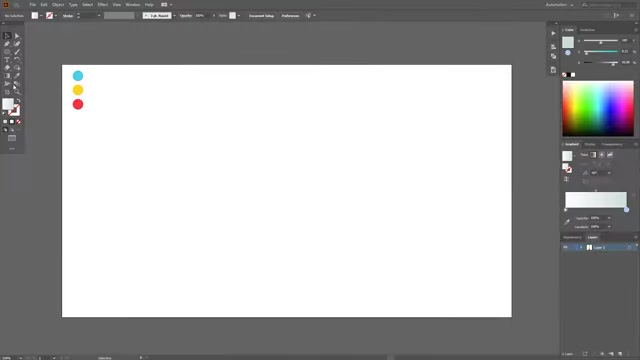
We will start with three simple circles and connecting them in a central creative design to make the infographic flow naturally, creating a visual rhythm. Choose a color palette that reflects the tone and theme of your infographic. Consider using a color scheme generator to find harmonious color combinations. Use gradients and shadows to add depth and dimension to your shapes, making them visually appealing. Make sure to copy all of the shapes and paste it back on to the page so we can take elements away from the original shape to highlight the important facts.
Laying Out and Connecting Shapes
Using an ellipse you want to ensure it overlays all three primary circles,
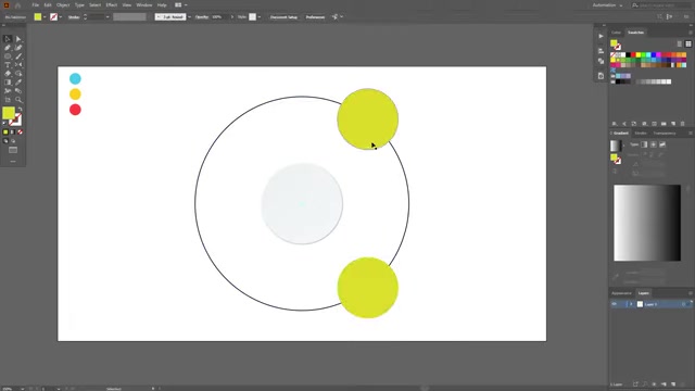
use the pathfinder tool to unify them creating a unique flow and shape for your infographic. Adjust the placement of the connecting circles to ensure a visually balanced composition. Consider using different sizes and colors for these shapes to create visual interest and hierarchy. The paths created by the Pathfinder tool will dictate how your information flows so it's crucial to get the flow correct.
Adding Depth and Dimension with Shadows
To give your infographic a professional look, add subtle shadows to create a sense of depth.
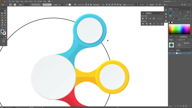
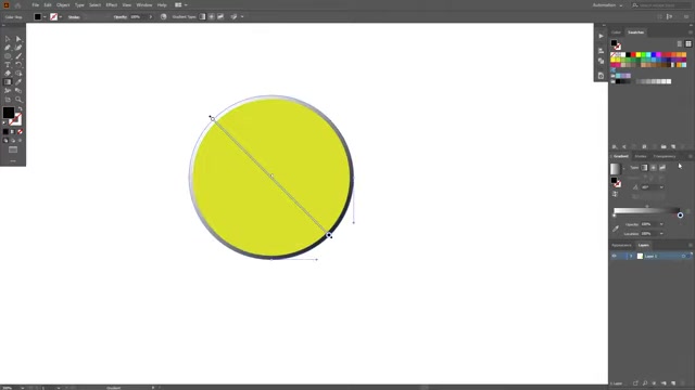
Duplicate the shapes and then give each shape a dark Outline to make the infographic pop. Experiment with different shadow angles and intensities to find what works best for your design. Subtle shadows can make a big difference in the overall visual appeal of your infographic.
Adding Icons and Visual Elements
Icons and visual elements are crucial for breaking up text and making your infographic more engaging. Choose icons that are Relevant to your content and consistent in style. [t: 702]Icons can serve as visual cues, helping viewers quickly understand the information being presented. The visual elements you use, should add to the flow and story being told by the infographic.
Adding Data and Infographic specific Icons
Icons are visual elements that add to the infographic, they help the viewers quickly understand the information being presented. [t: 1031]Using icons can help tell the data and the story of your infographic by providing the audience with visual clues. You want to ensure that they are well placed with proper spacing and color to bring out their key elements.
Advanced Techniques for Enhancing Your Infographic
Using Typography to Communicate Effectively
Typography is a powerful design element that can significantly impact the readability and visual appeal of your infographic. Choose fonts that are easy to read and Align with the overall tone of your design. Use different Font sizes and styles to create visual hierarchy, emphasizing key information. Avoid using too many different fonts, as this can create a cluttered and unprofessional look. Ensure that your text is legible at various sizes, especially if your infographic will be viewed on different devices. Legibility is Key!
Incorporating Data Visualizations
Data visualizations, such as charts and graphs, are essential for presenting quantitative information in an infographic. Adobe Illustrator offers a variety of tools for creating custom charts and graphs. [T:910]Use data to tell a story that will impact the end reader. Be sure to include data visualizations, such as charts and graphs. If you are presenting complex data, consider using Simplified visualizations to avoid overwhelming viewers. Use color and typography to make your charts and graphs visually appealing and easy to understand.
Strategic Use of Color
Color plays a crucial role in the effectiveness of your infographic. Use color to highlight key data points, create visual contrast, and Evoke emotions. Choose colors that are consistent with your brand or the theme of your infographic.
Be mindful of colorblindness and ensure that your infographic is accessible to all viewers. Use color to tell a story and to support the flow of information. Remember, that the correct colors and use of contrast can help you grab the readers attention and help bring out key facts.






Most people like






























Report
Please select a reason for reporting
- 13 Reasons to Switch from Snapchat to Text Messaging
- 7 Powerful Speech to Text Apps to Boost Productivity
- 10 Best Speech to Text Tools for Effortless Transcription
- 13 Free Tools to Easily Transcribe Audio to Text
- 15 Surprising Ways Google's Speech-to-Text Boosts Productivity
- 7 Best Free Online Audio to Text Transcription Tools
- 9 Tips to Transcribe Speech to Text Faster and Better
- 13 Best Speech to Text Software for Windows 10 in 2023
- 7 Tips for Choosing the Best Transcriber for Audio to Text
- 11 Reasons Why Dragon Speech-to-Text Apps are Game-Changers
- 6 Secrets to Enhance Your Speech to Text Transcription
- 6 Brilliant Ways to Boost Productivity with Talk-to-Text on Your MacBook
- 6 Ways Transcription Software Converts Audio to Text
- 8 Tips to Transcribe Speech to Text Like a Pro
- 6 Reasons IBM Watson Speech to Text is a Game-Changer
- 14 Powerful Ways Talk-to-Text Improves Your Workflow
- 12 Top Windows Speech-to-Text Software for Efficient Transcription
- 12 Game-Changing Benefits of Apple's Speech to Text Technology
- 9 Powerful Use Cases for AWS Speech to Text Technology
- 10 Easy Steps to Transcribe YouTube Videos to Text
- transcription audio en texte
- online audio transcription
- free audio file transcription
- free ai audio transcription
- audio transcription service
- audio transcription online free
- audio transcription free online
- audio to transcription software
- audio and transcript
- ai audio transcription free
- voice recording to text converter
- translate voice recording to text
- record voice to text
- audio recording to text converter
- voice recording and transcription
- chatgpt voice to text
- gmail voice to text
- speech to text reader
- speech to text ai free
- speech to talk
- Create Engaging Animated Explainer Videos with a Free AI Tool
- Stop Multi-Subscribing: Benchmark Top AI Visual Models in One Canvas
- Best Seedance 2.5 API Provider: Every Price on the Market, Checked at Source
- AI OnlyFans: How to Generate $30,000/Month (Legally)
- Transform Your Script into an Engaging Video with AI Video Maker!
- AI Marketing Automation: A Comprehensive Guide for Small Businesses
- Midjourney Alternative for Anime Art Creators: Why PixAI May Be Better for Character Workflows
- 10 Things Most People Get Wrong About AI Image Search
- AI Girlfriend Apps: Top Choices Redefining Relationships 2025
- How to Reduce Quoting Errors in Salesforce with AI-Assisted Quote Creation
- AI Resume Builders: EnhanceCV, ResumeNerd AI, & Teal Compared
- ResumeAI: Crafting ATS-Optimized Resumes with AI
- AI in Resume Writing: A New Era for Job Seekers
- AI Resume Tools: Streamline Your Job Search and Land Your Dream Role
- AI Resume Optimization: The Right Way to Land Interviews
- Crafting a Killer Resume with AI: A Step-by-Step Guide
- Crafting a Winning Resume: AI Tools and Expert Tips
- AI Job Search: Level Up Your Career with AI Automation
- Empower Your Career Journey: Dynamic Resumes with AI
- AI Resume Builder: Create Professional Resumes Effortlessly

Copyright ©2026 toolify