

















Table of Contents
- Key Points
- Getting Started with Infographic Design in Adobe Illustrator
- Designing the Infographic Elements and Styling Your Infographic
- Crafting Compelling Visual Narratives: Steps
- Understanding the Strengths and Limitations
- Frequently Asked Questions (FAQ)
- Related Questions


Getting Started with Infographic Design in Adobe Illustrator
Setting Up Your Document
Before diving into the design process, it's essential to set up your document correctly in Adobe Illustrator. A well-prepared document ensures a smooth workflow and optimal results for your infographic.
- Creating a New Document:
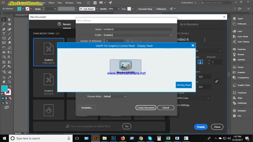
To start, open Adobe Illustrator and create a new document. Go to File > New. This will open the New Document dialog box, where you can specify various settings.
- Document Dimensions: For infographics, a common starting point is a long, vertical format. Consider using dimensions like 800 pixels in width and 2000 pixels in Height. You can adjust these Dimensions later as needed.
- Color Mode: Set the color mode to CMYK if your infographic is intended for print. For web-based infographics, choose RGB. The document color mode, Onyx is then selected in the Tutorial to be CMYK.
- Raster Effects: Set the Raster Effects to High (300 ppi) for high-resolution output. This is crucial for maintaining the quality of any Raster images or effects you use in your design.
- Bleed Settings: Bleed settings is set to 0.2 inches, bleed refers to the area that extends beyond the document's edge. It is to ensure that no white edges appear when the infographic is printed and trimmed. For digital infographics, you can generally set the bleed to 0.
- Preview Mode: Choose the Default preview mode for accurate color and appearance representation. This ensures that what you see on your screen closely matches the final output.
- Creating a frame: With the rectangle tool, select the document size to create a Shape to give the infographic a boundary, with size Width:12.09 in, and Height: 8.58 in
Essential Tools and Techniques
Adobe Illustrator offers a wide array of tools and techniques that are essential for infographic design. Mastering these tools will significantly enhance your ability to create visually appealing and informative graphics.
- Shape Tools: The Rectangle Tool (M), Ellipse Tool (L), and Polygon Tool are fundamental for creating basic shapes quickly. Use these tools to build infographic elements like boxes, circles, and polygons
.
- Pen Tool: The Pen Tool (P) is critical for creating custom shapes and precise paths. It allows you to draw intricate designs, icons, and illustrations. Practice using the Pen Tool to create smooth curves and sharp angles.
- Color Palette and Swatches: Use the Color Palette and Swatches to choose and manage your color scheme. A well-coordinated color palette enhances the visual appeal and helps guide the viewer's eye through the infographic. Consider using complementary colors or a monochromatic palette for a Cohesive look.
- Typography: Typography plays a crucial role in infographics. Experiment with different fonts, sizes, and styles to convey information clearly and effectively. Ensure that your text is legible and complements the overall design.
- Alignment and Distribution: Use the Align panel to ensure that your infographic elements are properly aligned and distributed. Proper alignment creates a clean, professional look and makes the infographic easier to read.
Designing the Infographic Elements and Styling Your Infographic
Creating Circular Data Points
Circular data points are effective for presenting data in a visually engaging way. Here’s how to create them in Illustrator:
- Creating a Circle: Use the Ellipse Tool (L) to draw a circle. Hold Shift while dragging to create a perfect circle. Set the fill color to your desired data point color, and add a contrasting stroke for definition.
- Duplicating Data Points:
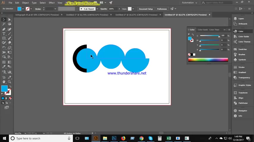
Duplicate the original shape by selecting it and using the transform tool, while selecting alt to ensure perfect spacing and alignment.
- Modifying size: You can then modify the size for different variations based on the infographic needs.
- Selecting Colors: Select a color from the color themes panel, this will then become the color of your infographic.
Create Shape Combinations to Match a Gauge
In order to visually show data in your infographic, it is recommended to find a shape to visually represent the ratio
- Select a shape: Use the Rectangle Tool (M) to draw a shape that is on top of your data point.
- Select the shaper tool: Choose the shape builder tool
- Remove: To remove sections of a shape, you will need to select the alt key, and click on the shape you want to delete. This will remove that shape.
Applying Gradients
Gradients can add depth and visual interest to your infographic elements. Here’s how to apply and customize them:
- Applying a Gradient: Select the shape you want to apply the gradient to. Open the Gradient panel (Window > Gradient).
- Adjust Gradient Sliders: Adjust the gradient sliders to control the color distribution and intensity. You can add, remove, and reposition color stops to achieve the desired effect.
- Types of Gradients:Experiment with different gradient types such as Linear, Radial, and Freeform Gradient to achieve the best visual outcome for your infographic elements.
Styling Tips and Techniques
Here are some additional styling tips to make your infographics stand out:
- Use Shadows and Highlights: Add subtle shadows and highlights to create depth and dimension. Use the Drop Shadow effect or the Appearance panel to add these effects.
- Apply Transparency: Use transparency to create overlays and subtle effects. Experiment with different blending modes to achieve unique visual outcomes.
- Incorporate Textures: Add textures to backgrounds or elements to give your infographic a more tactile feel. Use the Texture effect or import textured images.
- Maintain Consistency: Consistency is key to a professional-looking infographic. Use the same fonts, colors, and styling techniques throughout your design to create a cohesive visual experience.








Most people like






























Report
Please select a reason for reporting
- 13 Reasons to Switch from Snapchat to Text Messaging
- 7 Powerful Speech to Text Apps to Boost Productivity
- 10 Best Speech to Text Tools for Effortless Transcription
- 13 Free Tools to Easily Transcribe Audio to Text
- 15 Surprising Ways Google's Speech-to-Text Boosts Productivity
- 7 Best Free Online Audio to Text Transcription Tools
- 9 Tips to Transcribe Speech to Text Faster and Better
- 13 Best Speech to Text Software for Windows 10 in 2023
- 7 Tips for Choosing the Best Transcriber for Audio to Text
- 11 Reasons Why Dragon Speech-to-Text Apps are Game-Changers
- 6 Secrets to Enhance Your Speech to Text Transcription
- 6 Brilliant Ways to Boost Productivity with Talk-to-Text on Your MacBook
- 6 Ways Transcription Software Converts Audio to Text
- 8 Tips to Transcribe Speech to Text Like a Pro
- 6 Reasons IBM Watson Speech to Text is a Game-Changer
- 14 Powerful Ways Talk-to-Text Improves Your Workflow
- 12 Top Windows Speech-to-Text Software for Efficient Transcription
- 12 Game-Changing Benefits of Apple's Speech to Text Technology
- 9 Powerful Use Cases for AWS Speech to Text Technology
- 10 Easy Steps to Transcribe YouTube Videos to Text
- transcription audio en texte
- online audio transcription
- free audio file transcription
- free ai audio transcription
- audio transcription service
- audio transcription online free
- audio transcription free online
- audio to transcription software
- audio and transcript
- ai audio transcription free
- voice recording to text converter
- translate voice recording to text
- record voice to text
- audio recording to text converter
- voice recording and transcription
- chatgpt voice to text
- gmail voice to text
- speech to text reader
- speech to text ai free
- speech to talk
- Create Engaging Animated Explainer Videos with a Free AI Tool
- Stop Multi-Subscribing: Benchmark Top AI Visual Models in One Canvas
- Best Seedance 2.5 API Provider: Every Price on the Market, Checked at Source
- AI OnlyFans: How to Generate $30,000/Month (Legally)
- Transform Your Script into an Engaging Video with AI Video Maker!
- AI Marketing Automation: A Comprehensive Guide for Small Businesses
- Midjourney Alternative for Anime Art Creators: Why PixAI May Be Better for Character Workflows
- 10 Things Most People Get Wrong About AI Image Search
- AI Girlfriend Apps: Top Choices Redefining Relationships 2025
- How to Reduce Quoting Errors in Salesforce with AI-Assisted Quote Creation
- AI Resume Builders: EnhanceCV, ResumeNerd AI, & Teal Compared
- ResumeAI: Crafting ATS-Optimized Resumes with AI
- AI in Resume Writing: A New Era for Job Seekers
- AI Resume Tools: Streamline Your Job Search and Land Your Dream Role
- AI Resume Optimization: The Right Way to Land Interviews
- Crafting a Killer Resume with AI: A Step-by-Step Guide
- Crafting a Winning Resume: AI Tools and Expert Tips
- AI Job Search: Level Up Your Career with AI Automation
- Empower Your Career Journey: Dynamic Resumes with AI
- AI Resume Builder: Create Professional Resumes Effortlessly

Copyright ©2026 toolify