

















Table of Contents
- Key Points
- Creating Your Geometric Font
- Different Fontself Alternatives
- Adobe Illustrator and Fontself: Pros and Cons
- Frequently Asked Questions
- Related Questions


Creating Your Geometric Font
Setting Up Your Design Grid in Adobe Illustrator
The foundation of any good geometric Font lies in a well-defined grid system. This GRID provides the framework for consistent proportions and visual harmony across all characters.
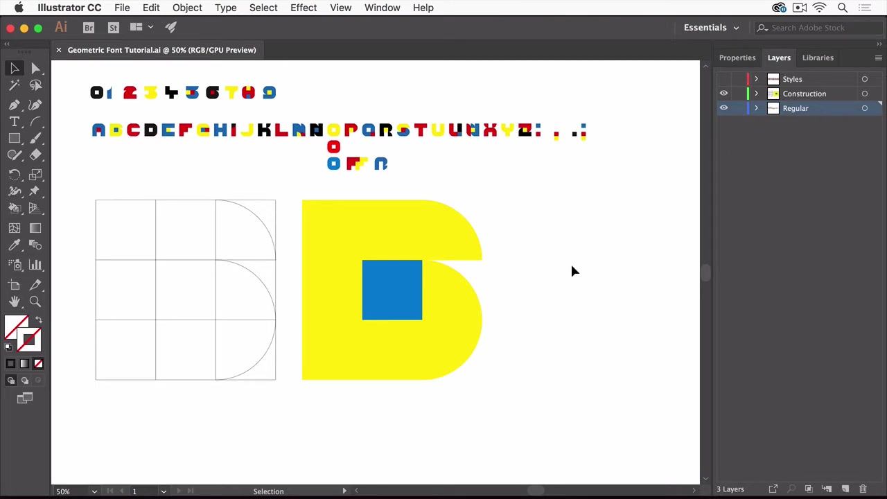
Begin by creating a new document in Adobe Illustrator. Then, set up a grid comprising nine equal parts using the rectangular grid tool.
Why a Nine-Part Grid?
The nine-part grid offers a balanced structure for constructing letterforms. It allows you to create consistent widths, heights, and curves, crucial for geometric designs. This grid also facilitates the creation of quarter circles, another important element that the video utilizes to create the font. The precise design is built from the quarter circle and its placement on the established grid.
Utilizing Smart Guides and the Arc Tool
To ensure accuracy, enable Smart Guides in Illustrator (View > Smart Guides). These guides will help you snap your shapes precisely to the grid lines, guaranteeing uniformity. Employ the Arc Tool to create the quarter circles, snapping their endpoints to the grid intersections. This is the method used to create the specific geometric font.
The video used smart guides to have exact snapping and the arc tool to create these exact geometric parts. The importance of smart guides cannot be overstated.
Key takeaway: The grid provides the system, the arc tool is the method to get the design elements, and smart guides make the system easier to interact with. The intersection of these elements creates the final font design.
From Live Paint to Streamlined Glyphs: Preparing Your Letters
Once your initial letterforms are designed using the grid and arc tool, it's time to refine them for Fontself integration. The video recommends using the Live Paint feature in Adobe Illustrator. Live Paint enables you to easily Colorize enclosed areas within your design
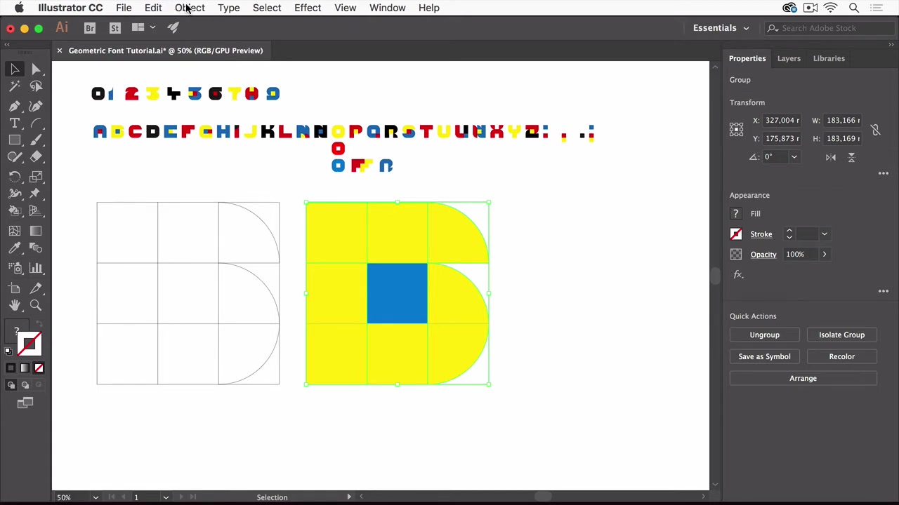
. While Live Paint is convenient for initial colorization, it's essential to expand the Live Paint group before importing into Fontself.
Expanding Live Paint Groups
To expand the Live Paint group, select the letterform and navigate to Object > Expand. This converts the Live Paint group into individual paths. However, even after expanding, the glyph might contain unnecessary paths and anchor points. Therefore, pathfinder tool is necessary.
Pathfinder Optimization
The Pathfinder panel in Illustrator is your go-to tool for optimizing vector shapes. Here’s how to use it for font creation:
- Ungrouping: Ungroup the expanded Live Paint group (Object > Ungroup) to access individual shapes .
- Pathfinder Options: Open the Pathfinder panel (Window > Pathfinder) and access its options. Enable “Remove Redundant Points” to simplify the paths and reduce file size .
- Merge: Use the “Merge” function in Pathfinder to combine overlapping shapes into a single, clean path . This eliminates unnecessary divisions and anchor points.
Grouping for Fontself
After using the pathfinder tool, re-group all paths, so that Fontself can recognize them. It is important to recognize that these are the steps to get a good file for Fontself, as Fontself works best with organized files.
Here is a quick look at the steps necessary for creating glyphs in Fontself:
| Step | Action | Description |
|---|---|---|
| 1 | Create Grid | Set up grid system in Illustrator. |
| 2 | Arc Tool | Design basic letter forms with the Arc Tool. |
| 3 | Live Paint | Colorize forms with live paint. |
| 4 | Expand | Expand Live Paint objects into shapes. |
| 5 | Pathfinder | Unite the parts into shapes. |
| 6 | Group | Group the shapes together. |
By following these steps, you ensure that your letterforms are clean, optimized, and ready for seamless integration into Fontself.
Fontself: The Illustrator Plugin That Makes Font Creation Easy
Fontself is an incredibly useful plugin for Adobe Illustrator that bridges the gap between vector design and font creation. It allows you to quickly turn your Illustrator artwork into fully functional OpenType fonts. [t:00:16] It is important to note that they offer a template to create fonts with a sophisticated font set and guides.
Utilizing Fontself to Build Your Font
- Accessing Fontself: You can access Fontself through the Window > Extensions menu in Illustrator [t:00:07].
- Batch Import: With your prepared letterforms arranged and aligned in Illustrator, select them all and click the “A-Z” button in Fontself. This automatically imports each selected element as a glyph into the Fontself panel [t:03:25]. Make sure your letters are in order for this to work correctly!
- Customization: Fontself offers advanced settings for kerning, scaling, and other typographic adjustments. Experiment with these settings to refine the appearance and spacing of your font.
- Font Export: Once you’re satisfied with your font, click the “Export” button in Fontself. You can save your font in various formats, including OTF (OpenType Font), which is widely compatible with design software and operating systems.
Why Fontself?
Fontself simplifies a traditionally complex process, making font creation accessible to a wider range of designers. Its intuitive interface and seamless integration with Illustrator make it a valuable tool for anyone looking to create custom fonts quickly and efficiently.
Additional Design Considerations
Special Characters and Ligatures
Geometric fonts often benefit from the inclusion of carefully crafted special characters and ligatures. Ligatures are characters that combine two or more letters into a single glyph, often to improve readability or visual appeal.
Ligatures can assist in improving readability in some cases. For example, when a lowercase F and a lowercase I are next to each other, the top of the F can collide with the dot of the I. Therefore, a ligature in that case would serve to add visual consistency to the font overall.
Testing and Iteration
Creating a font is an iterative process. After exporting your font, test it in various design applications and text editors. Pay attention to the legibility of your font at different sizes and in different contexts. Take advantage of feedback to improve the overall quality of your design.
Why is testing your font important?
Testing helps identify areas for improvement, such as kerning inconsistencies, awkward character combinations, or issues with overall readability. Iterate on your design based on your observations and feedback, making refinements until you achieve a polished and professional-quality font.












Most people like


























Report
Please select a reason for reporting
- 13 Reasons to Switch from Snapchat to Text Messaging
- 7 Powerful Speech to Text Apps to Boost Productivity
- 10 Best Speech to Text Tools for Effortless Transcription
- 13 Free Tools to Easily Transcribe Audio to Text
- 15 Surprising Ways Google's Speech-to-Text Boosts Productivity
- 7 Best Free Online Audio to Text Transcription Tools
- 9 Tips to Transcribe Speech to Text Faster and Better
- 13 Best Speech to Text Software for Windows 10 in 2023
- 7 Tips for Choosing the Best Transcriber for Audio to Text
- 11 Reasons Why Dragon Speech-to-Text Apps are Game-Changers
- 6 Secrets to Enhance Your Speech to Text Transcription
- 6 Brilliant Ways to Boost Productivity with Talk-to-Text on Your MacBook
- 6 Ways Transcription Software Converts Audio to Text
- 8 Tips to Transcribe Speech to Text Like a Pro
- 6 Reasons IBM Watson Speech to Text is a Game-Changer
- 14 Powerful Ways Talk-to-Text Improves Your Workflow
- 12 Top Windows Speech-to-Text Software for Efficient Transcription
- 12 Game-Changing Benefits of Apple's Speech to Text Technology
- 9 Powerful Use Cases for AWS Speech to Text Technology
- 10 Easy Steps to Transcribe YouTube Videos to Text
- transcription audio en texte
- online audio transcription
- free audio file transcription
- free ai audio transcription
- audio transcription service
- audio transcription online free
- audio transcription free online
- audio to transcription software
- audio and transcript
- ai audio transcription free
- voice recording to text converter
- translate voice recording to text
- record voice to text
- audio recording to text converter
- voice recording and transcription
- chatgpt voice to text
- gmail voice to text
- speech to text reader
- speech to text ai free
- speech to talk
- Create Engaging Animated Explainer Videos with a Free AI Tool
- Stop Multi-Subscribing: Benchmark Top AI Visual Models in One Canvas
- Best Seedance 2.5 API Provider: Every Price on the Market, Checked at Source
- AI OnlyFans: How to Generate $30,000/Month (Legally)
- Transform Your Script into an Engaging Video with AI Video Maker!
- AI Marketing Automation: A Comprehensive Guide for Small Businesses
- Midjourney Alternative for Anime Art Creators: Why PixAI May Be Better for Character Workflows
- 10 Things Most People Get Wrong About AI Image Search
- AI Girlfriend Apps: Top Choices Redefining Relationships 2025
- How to Reduce Quoting Errors in Salesforce with AI-Assisted Quote Creation
- Convert PDF to Audio: Free Urdu Text-to-Speech Tool
- Automatically Transcribe and Subtitle Audio and Video with Descript
- Revolutionize your video editing with AI-generated transcripts
- Mastering Wordpad: Essential Tips for Windows 10 Users
- AfirstSoft PDF Editor: The Ultimate PDF Solution of 2025
- UPDF: The Ultimate PDF Editor for iPadOS and macOS
- Translate PDF Documents: A Comprehensive Guide with OnlineDocTranslator
- Tenorshare PDNob PDF Editor: Smarter AI-Powered Editing
- uPDF Pro Review: AI-Powered PDF Editing for Professionals
- Master the Art of Wrapping Text in Illustrator CC

Copyright ©2026 toolify