


Most people like

Girlfriendly AI

 50.9K
50.9K
 61.83%
 5
5
Engage in AI conversations and develop unique personalities.
AI Chatbot
AI Girlfriend
AI Character
NSFW
Writing Assistants
AI Content Generator
AD

VMEG - Clips to Videos
57.6K
 21.65%
36
21.65%
36
Transform Clips into Captivating Marketing Videos with AI
AI Script Writing
AI Video Editor
AI Advertising Assistant
Digital Marketing Generator
AI Instagram Assistant
AI YouTube Assistant
AI Facebook Assistant
AI Tiktok Assistant
AI Social Media Assistant
AI Ad Creative Assistant
Video to Video
AD

VMEG
57.6K
21.65%
42
A Video Translation Multilingual Tool By AI
Translate
Transcription
Transcriber
Video to Video
AI Lip Sync Generator
AI Advertising Assistant
AI Short Clips Generator
AI Ad Generator
AI Content Generator
Captions or Subtitle
AI Personalized Video Generator
AI Video Generator
AD

Macky AI
18.6K
 54.17%
16
54.17%
16
AI-powered consulting platform providing high-level insights from simple questions.
AI Consulting Assistant
Research Tool
AD

Favie - Crush on your favorites
< 5K
8
Personalized AI shopping assistant
Sales Assistant
AI Customer Service Assistant
AI Analytics Assistant
AI Reviews Assistant
AI Social Media Assistant
AI CRM Assistant
AI Lead Generation
AD

Promptchan AI
1.3M
17.48%
45
Free Girl AI Image Generator
AI Girlfriend
AI Anime Art
NSFW
AI Character
AI Art Generator
Text to Image
AI Photo & Image Generator
AI Illustration Generator
AI Background Generator
AI GIF Generator
AI Anime & Cartoon Generator
AI Avatar Generator
AI Manga & Comic
AD

Chromox
41K
 18.13%
10
18.13%
10
The best Free OpenAI Sora alternatives for generating AI videos.
Text to Image
AI Video Generator
AI Photo & Image Generator
AI Animated Video
Image to Video
Text to Video
Image to Image
AI Anime & Cartoon Generator
AI Photography
AI Image Enhancer
AD
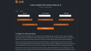
Erota
24.1K
27.33%
36
AI-written erotic stories tailored to your desires.
Large Language Models (LLMs)
NSFW
AI Story Writing
AI Creative Writing
AD

HeraHaven
680.4K
24.58%
18
Satisfy Your Darkest Fantasies (The Ones You Can’t Share With Anyone)
AI Girlfriend
AD

NSFWChatAI
< 5K
80.83%
7
NSFWChatAI.ai is an AI virtual girlfriend chatbot website where you can chat with your virtual girlfriend without restraint.
AI Photo & Image Generator
AI Anime & Cartoon Generator
AI Chatbot
AI Girlfriend
AI Character
AD

DressPlay
18.1K
50.42%
9
DressPlay is an innovative AI Clothes Changer app designed for users who enjoy exploring different styles and for e-commerce businesses.
AI Photo & Image Generator
Photo & Image Editor
AI Pattern Generator
Image to Image
AI Charting
AI UGC Video Generator
AI Short Clips Generator
Research Tool
Sales Assistant
E-commerce Assistant
AD

Outpeach
< 5K
4
Online platform for private and intimate conversations.
AI Chatbot
NSFW
AD
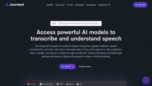
AssemblyAI
591.1K
 27.63%
7
27.63%
7
AssemblyAI provides AI models for transcribing and understanding speech through a user-friendly API.
AI Speech Recognition
Speech-to-Text
Transcriber
Transcription
AI API Design
AI Developer Tools
AI Voice Assistants
AI Developer Docs
AD

PageOn.ai
12.3K
46.84%
6
An AI tool for creating stunning presentations and media content.
AI Presentation Generator
AD

Rolemantic AI
473K
76.68%
76
NSFW AI Chat and Image Generation
NSFW
Text to Image
AI Avatar Generator
AI Photography
AI Selfie & Portrait
Image to Image
AI Cosplay Generator
AI Chatbot
AI Girlfriend
AI Character
AI Photo & Image Generator
AD

AiAssistWorks - AI for Sheets
< 5K
 100%
3
100%
3
Access 50+ AI models in Google Sheets™ effortlessly. Save and reuse prompts. Use Perplexity online model and Groq Fast API.
AI Spreadsheet
AI Analytics Assistant
Digital Marketing Generator
Large Language Models (LLMs)
Translate
Copywriting
AI Creative Writing
AI Content Generator
AI Product Description Generator
AI Ad Generator
AI SEO Assistant
AI Social Media Assistant
AD

Transcriptmate.com
< 5K
5
Audio-to-text transcription on-demand
AI Product Description Generator
AI Speech Recognition
Recording
Speech-to-Text
Transcriber
Transcription
AI Advertising Assistant
AD

Automateed
58.9K
17.51%
5
Effortlessly create and publish eBooks with AI
AI Book Writing
AI Content Generator
AD

Chatsimple
62.5K
53.91%
8
Chatsimple is an AI chatbot platform for businesses to deploy custom chatbots on websites without coding.
AI Chatbot
AI Website Builder
No-Code&Low-Code
AI Advertising Assistant
Large Language Models (LLMs)
AI Customer Service Assistant
AI Website Designer
AD
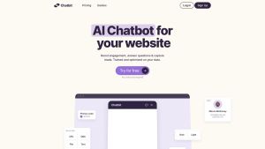
Chatbit
7K
62.52%
46
Custom AI chatbots trained on your data.
AI Chatbot
Writing Assistants
AI Voice Assistants
AD

SellerPic
< 5K
69.38%
1
AI tool for creating fashion models and product images for e-commerce.
AI Product Description Generator
AI Photo & Image Generator
AI Image Enhancer
Photo & Image Editor
AI Photo Enhancer
E-commerce Assistant
AD

Glitching
457.1K
13.47%
8
Find winning products and scale your Shopify dropshipping business effortlessly.
AI Advertising Assistant
AI Course
AI Product Description Generator
E-commerce Assistant
AD
Find AI tools in Toolify
Join TOOLIFY to find the ai tools
Get started
Sign Up
- App rating
- 4.9
- AI Tools
- 20k+
- Trusted Users
- 5000+
- No complicated
-

- No difficulty
-

- Free forever
-

Browse More Content
GPTS
- Discover Leanbe: Boost Your Customer Engagement and Product Development
- Unlock Your Productivity Potential with LeanBe
- Unleash Your Naval Power! Best Naval Civs in Civilization 5 - Part 7
- Master Algebra: Essential Guide for March SAT Math
- Let God Lead and Watch Your Life Transform | Inspirational Video
- Magewell XI204XE SD/HD Video Capture Card Review
- Discover Nepal's Ultimate Hiking Adventure
- Master the Art of Debugging with Our Step-by-Step Guide
- Maximize Customer Satisfaction with Leanbe's Feedback Tool
- Unleashing the Power of AI: A Closer Look
Stable Video Diffusion
- Transform Your Images with Microsoft's BING and DALL-E 3
- Create Stunning Images with AI for Free!
- Unleash Your Creativity with Microsoft Bing AI Image Creator
- Create Unlimited AI Images for Free!
- Discover the Amazing Microsoft Bing Image Creator
- Create Stunning Images with Microsoft Image Creator
- AI Showdown: Stable Diffusion vs Dall E vs Bing Image Creator
- Create Stunning Images with Free Ai Text to Image Tool
- Unleashing Generative AI: Exploring Opportunities in QE&T
- Create a YouTube Channel with AI: ChatGPT, Bing Image Maker, Canva
Gemini AI
- Google's AI Demo Scandal Sparks Stock Plunge
- Unveiling the Yoga Master: the Life of Tirumalai Krishnamacharya
- Hilarious Encounter: Jimmy's Unforgettable Moment with Robert Irwin
- Google's Incredible Gemini Demo: Unveiling the Future
- Say Goodbye to Under Eye Dark Circles - Simple Makeup Tips
- Discover Your Magical Soul Mate in ASMR Cosplay Role Play
- Boost Kidney Health with these Top Foods
- OpenAI's GEMINI 1.0 Under Scrutiny
- Unveiling the Mind-Blowing Gemini Ultra!
- Shocking AI News: Google's Deception Exposed!
Hardware
- Can AMD's FSR Save Nvidia GT 1030? Review & Benchmark
- Experience the Power of Dell Precision 5530: 4K Display, NVIDIA Quadro, and More!
- Optimize Mining Performance with AMD & NVIDIA Mixed Card in HIVEOS
- Unleash the Power: Building a Gaming PC with Server Gear
- How to Setup Xbox Game Pass Cloud Gaming on Android TV
- Unlocking the Full Potential of AMD 1055T: Overclocking Adventure
- Performance Test: 4 Two-in-One Devices Compared
- Gaming on an Nvidia Quadro Card: Can It Deliver a Satisfying Experience?
- Intel's New Core i9-14900K: Faster than Core i9-13900K?
- Unleashing the Power: Ryzen 7 1700 vs 2700X Performance Comparison
Related Articles


Refresh Articles
