


Design a Stylish Vertical Menu Using LESS CSS
Find AI Tools No difficulty
No complicated process
Find ai tools
No difficulty
No complicated process
Find ai tools


Most people like

VMEG

 41.4K
41.4K
 54.44%
 56
56
A Video Translation Multilingual Tool By AI
Translate
Transcription
Transcriber
Video to Video
AI Lip Sync Generator
AI Advertising Assistant
AI Short Clips Generator
AI Ad Generator
AI Content Generator
Captions or Subtitle
AI Personalized Video Generator
AI Video Generator
AD
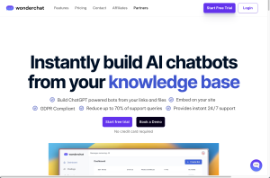
Wonderchat
57.3K
 25.28%
70
25.28%
70
Create custom chatbot with Wonderchat, boost customer response speed by 100% and reduce workload.
AI Chatbot
AI Reply Assistant
Large Language Models (LLMs)
AD

PolyBuzz
14M
54.77%
17
PolyBuzz offers free, private, and unrestricted AI chat and immersive roleplay with over 20 million characters.
AI Chatbot
AI Character
AI Anime Art
AI Art Generator
Text-to-Speech
AD

CollegeBot.AI
< 5K
0
AI platform for academic questions and job search assistance.
Other
AD

iDox.ai
59.8K
57.41%
1
Take the hassle out of redaction. Auto-redact text, signatures, logos & more.
AI PDF
AI WORD
AI Monitor & Report Builder
AI Document Extraction
AD

Lumen Scaler
< 5K
4
AI service enhances low-resolution photos into professional quality.
AI Art Generator
Healthcare
AI Image Enhancer
AI Photo Enhancer
AI Selfie & Portrait
AD

BooSum
< 5K
2
AI-driven tool to summarize and enhance book reading experience.
AI PDF
Summarizer
AD

Syft AI: Best News Assistant AI Tool
< 5K
2
Best News Aggregator: Stay Ahead on What Matters to You with Syft AI 📰✨ Simply tell Syft the topics you want to stay updated, and easily get news feeds, tailored updates, and breaking stories: summarized and pushed in your language, from authoritative direct local sources from all over the world. Syft AI is a web-based revolutionary tool designed to streamline your information consumption. By leveraging natural language processing, Syft allows users to effortlessly subscribe to any topic of interest, ensuring that you stay updated with the latest content without the hassle of sifting through multiple sources.
Newsletter
Life Assistant
AI Chatbot
Research Tool
AI Advertising Assistant
AI Knowledge Management
AI Knowledge Base
AI Social Media Assistant
AI Blog Writer
Investing Assistant
E-commerce Assistant
Translate
AI Twitter Assistant
Writing Assistants
Copywriting
Summarizer
Report Writing
AD
Are you spending too much time looking for ai tools?
- App rating
- 4.9
- AI Tools
- 100k+
- Trusted Users
- 5000+
 WHY YOU SHOULD CHOOSE TOOLIFY
TOOLIFY is the best ai tool source.
Browse More Content
AI News
- The Ultimate Guide to Hiring: Benefits and Drawbacks of Third-Party Recruiters
- Revolutionizing Dental Care: How AI is Transforming the Dental Industry
- How Do Proxies Work? An In-Depth Look at Their Role in Secure Web Browsing
- Practical Tips for Balancing AI Innovation and Privacy Concerns
- Local vs. National SEO for Lawyers: Key Differences
- Pinterest Perfection: How to Create a Stunning Feed with AI Tools
- Boost Your Marketing with AI-Powered Ad Creation Tools
- Executing Usability Tests For Mobile Apps
- The Future of Legal Tech: How Automation and AI Will Transform Law Firms
- A Guide to Selecting Machine Learning Tools for Your Job
Stable Video Diffusion
- Transform Your Images with Microsoft's BING and DALL-E 3
- Create Stunning Images with AI for Free!
- Unleash Your Creativity with Microsoft Bing AI Image Creator
- Create Unlimited AI Images for Free!
- Discover the Amazing Microsoft Bing Image Creator
- Create Stunning Images with Microsoft Image Creator
- AI Showdown: Stable Diffusion vs Dall E vs Bing Image Creator
- Create Stunning Images with Free Ai Text to Image Tool
- Unleashing Generative AI: Exploring Opportunities in QE&T
- Create a YouTube Channel with AI: ChatGPT, Bing Image Maker, Canva
Gemini AI
- Google's AI Demo Scandal Sparks Stock Plunge
- Unveiling the Yoga Master: the Life of Tirumalai Krishnamacharya
- Hilarious Encounter: Jimmy's Unforgettable Moment with Robert Irwin
- Google's Incredible Gemini Demo: Unveiling the Future
- Say Goodbye to Under Eye Dark Circles - Simple Makeup Tips
- Discover Your Magical Soul Mate in ASMR Cosplay Role Play
- Boost Kidney Health with these Top Foods
- OpenAI's GEMINI 1.0 Under Scrutiny
- Unveiling the Mind-Blowing Gemini Ultra!
- Shocking AI News: Google's Deception Exposed!
Hardware
- Optimize Mining Performance with AMD & NVIDIA Mixed Card in HIVEOS
- Unleash the Power: Building a Gaming PC with Server Gear
- How to Setup Xbox Game Pass Cloud Gaming on Android TV
- Unlocking the Full Potential of AMD 1055T: Overclocking Adventure
- Performance Test: 4 Two-in-One Devices Compared
- Gaming on an Nvidia Quadro Card: Can It Deliver a Satisfying Experience?
- Intel's New Core i9-14900K: Faster than Core i9-13900K?
- Unleashing the Power: Ryzen 7 1700 vs 2700X Performance Comparison
- Essential Hardware and Software for Starting a Business
- Want to enhance your VR headset experience with AI? Here's how to do it!
Related Articles


Refresh Articles
